"David Brizendine conducts himself with the utmost professionalism to deliver impressive results to his valued clients. As a specialist in the Acquisition and Marketing of Residential, Luxury, and Investment Properties, you may trust in his knowledgeable and insightful assessment and careful analysis. Through his valuable expertise and dedication, he is able to provide his clients with excellent opportunities that currently exist in the distinct communities located within the Greater Westside LA real estate market. Diligently acting on behalf of his clients David and his team deliver impressive results that readily exceed their clients’ expectations." (text source: Compass website)
Client: David Brizendine, The Brizendine Group | https://www.compass.com
Logomark/Initial Brand Identity: Seth Cox
Role: Branding update, stationary, print collateral
// Projects //
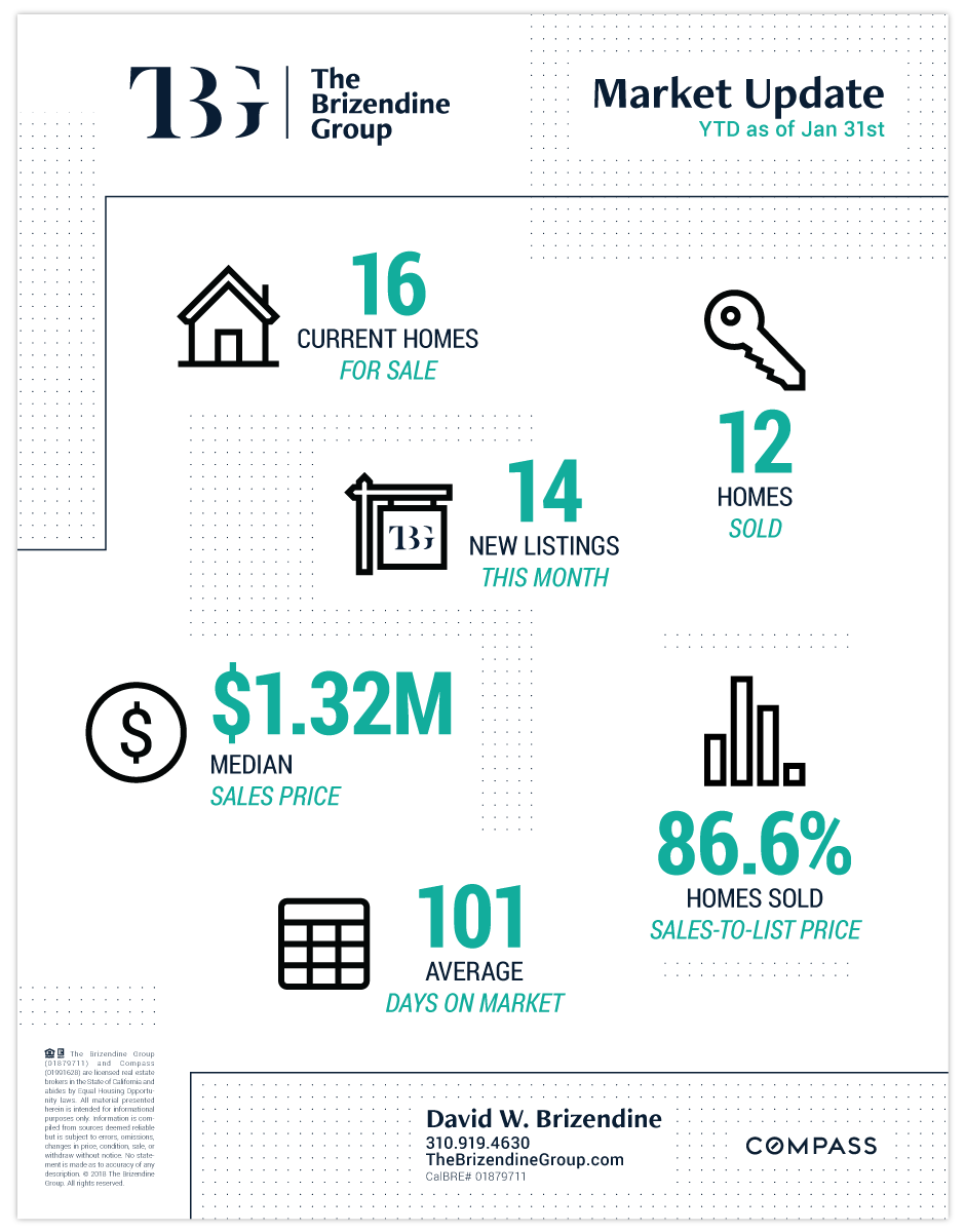
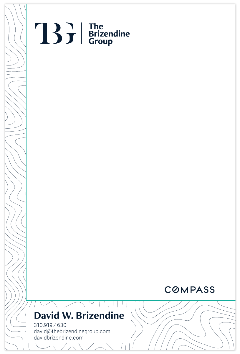
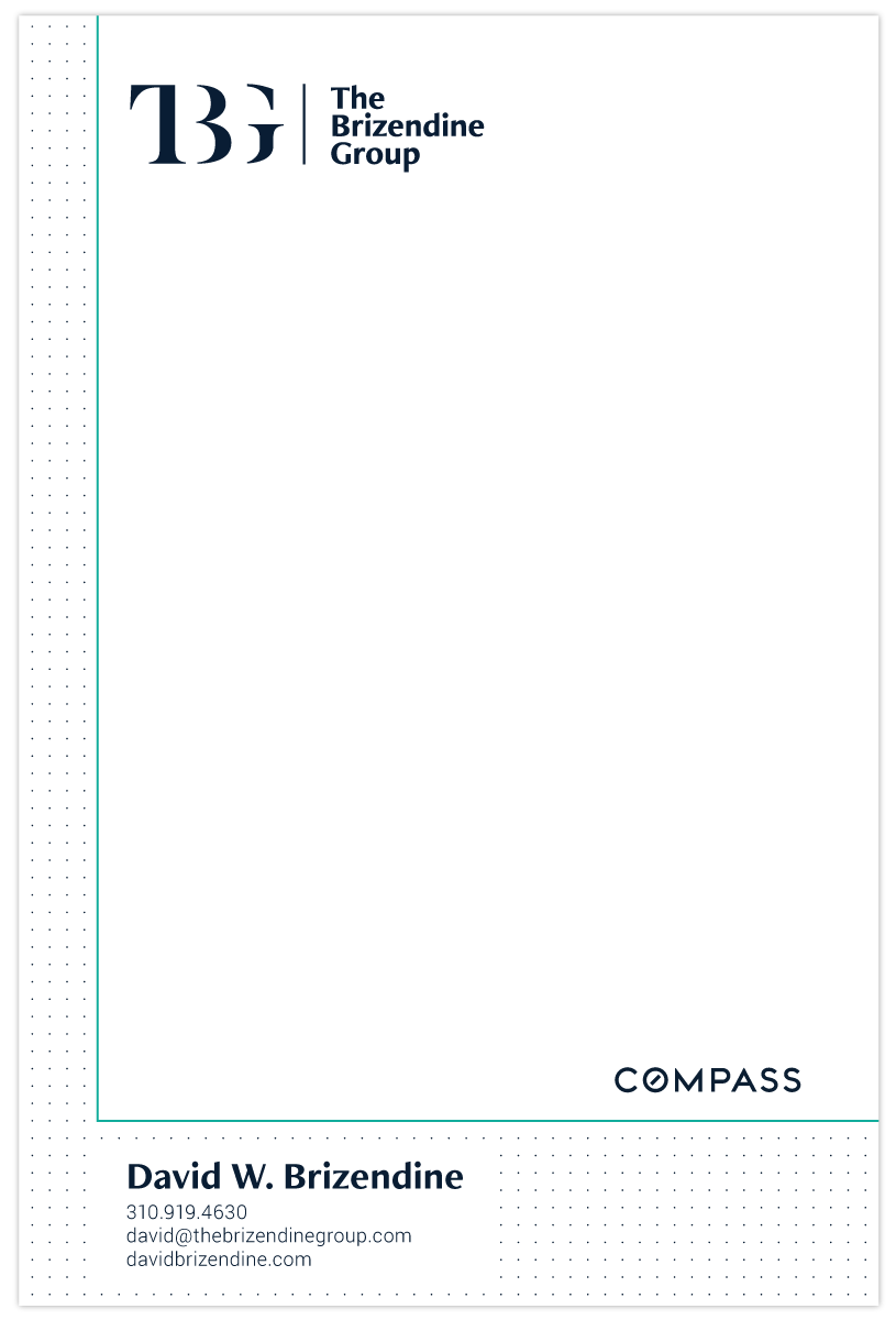
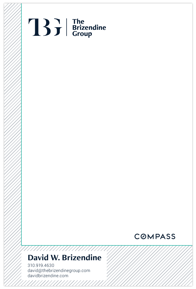
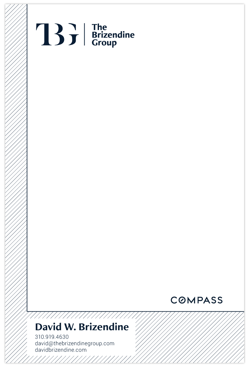
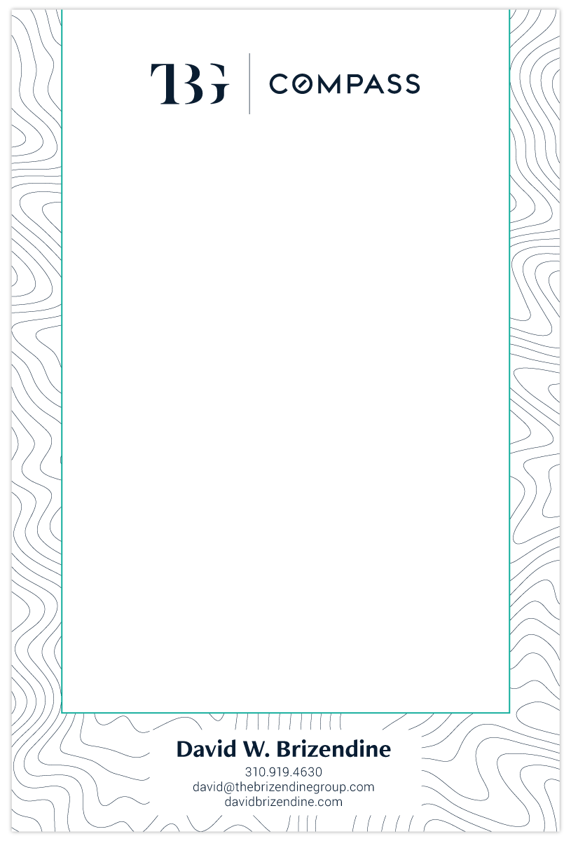
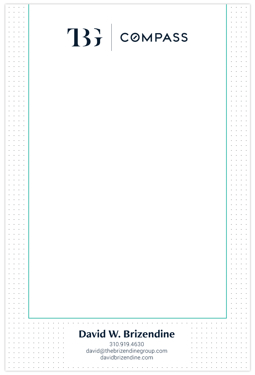
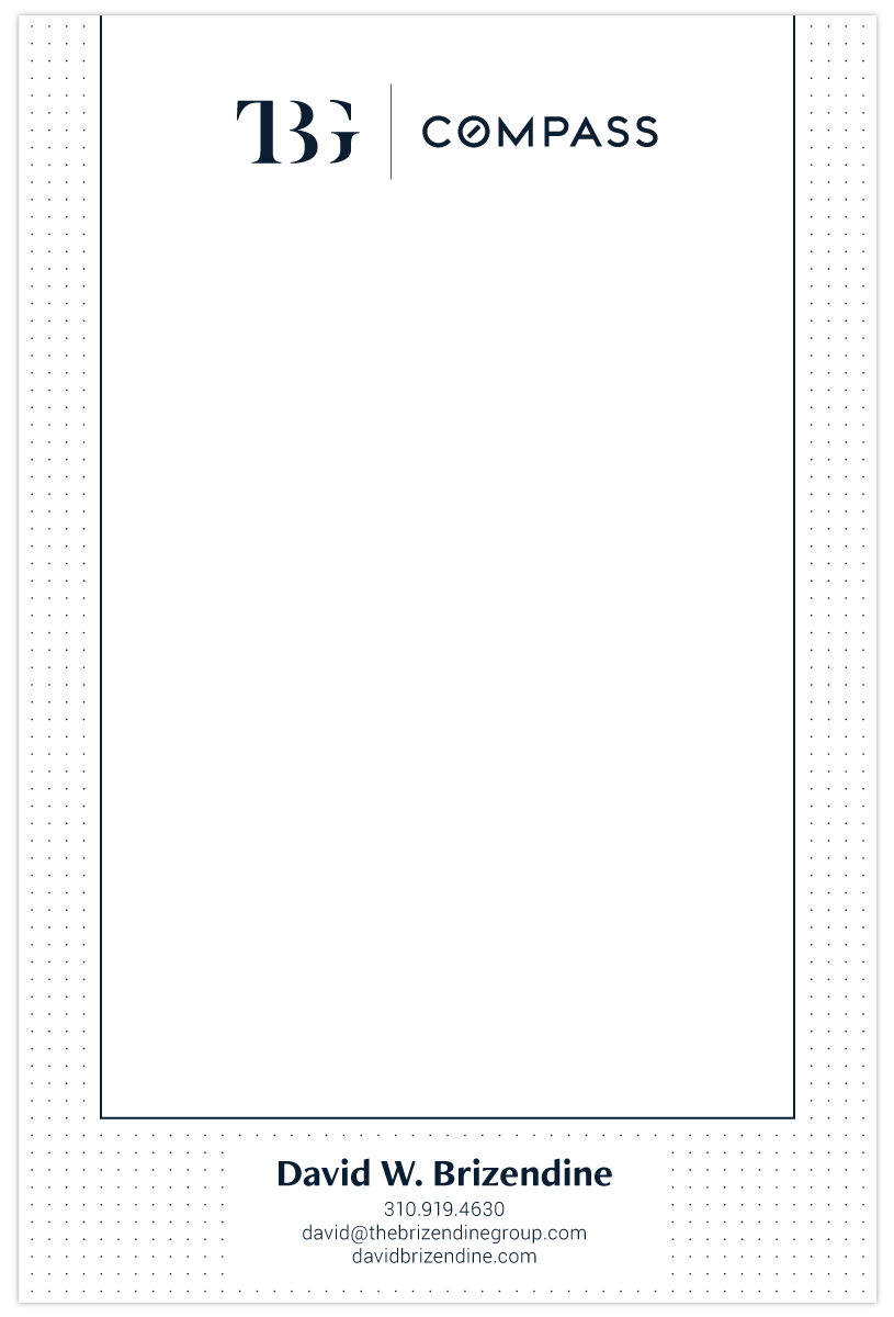
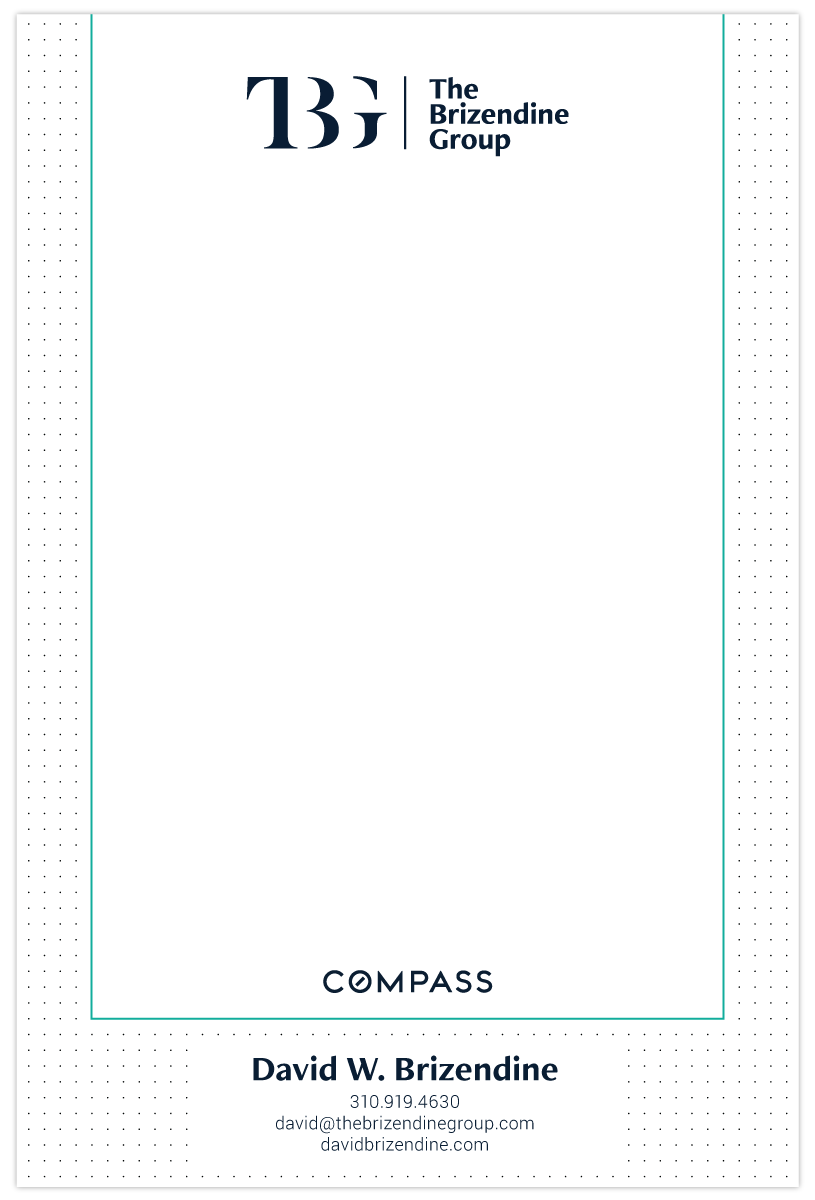
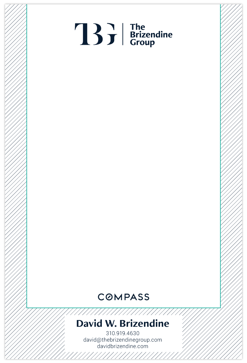
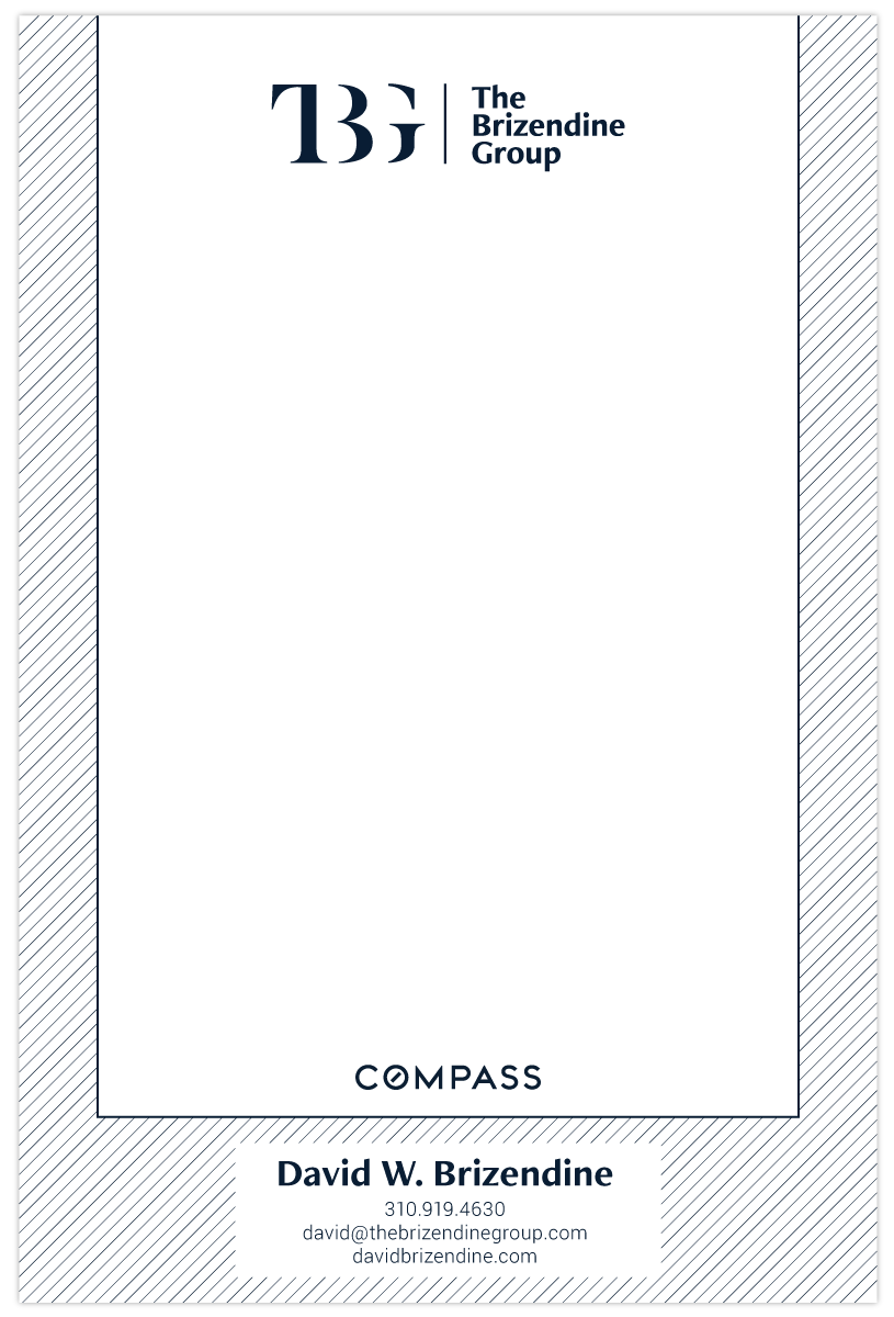
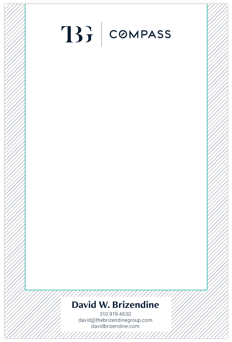
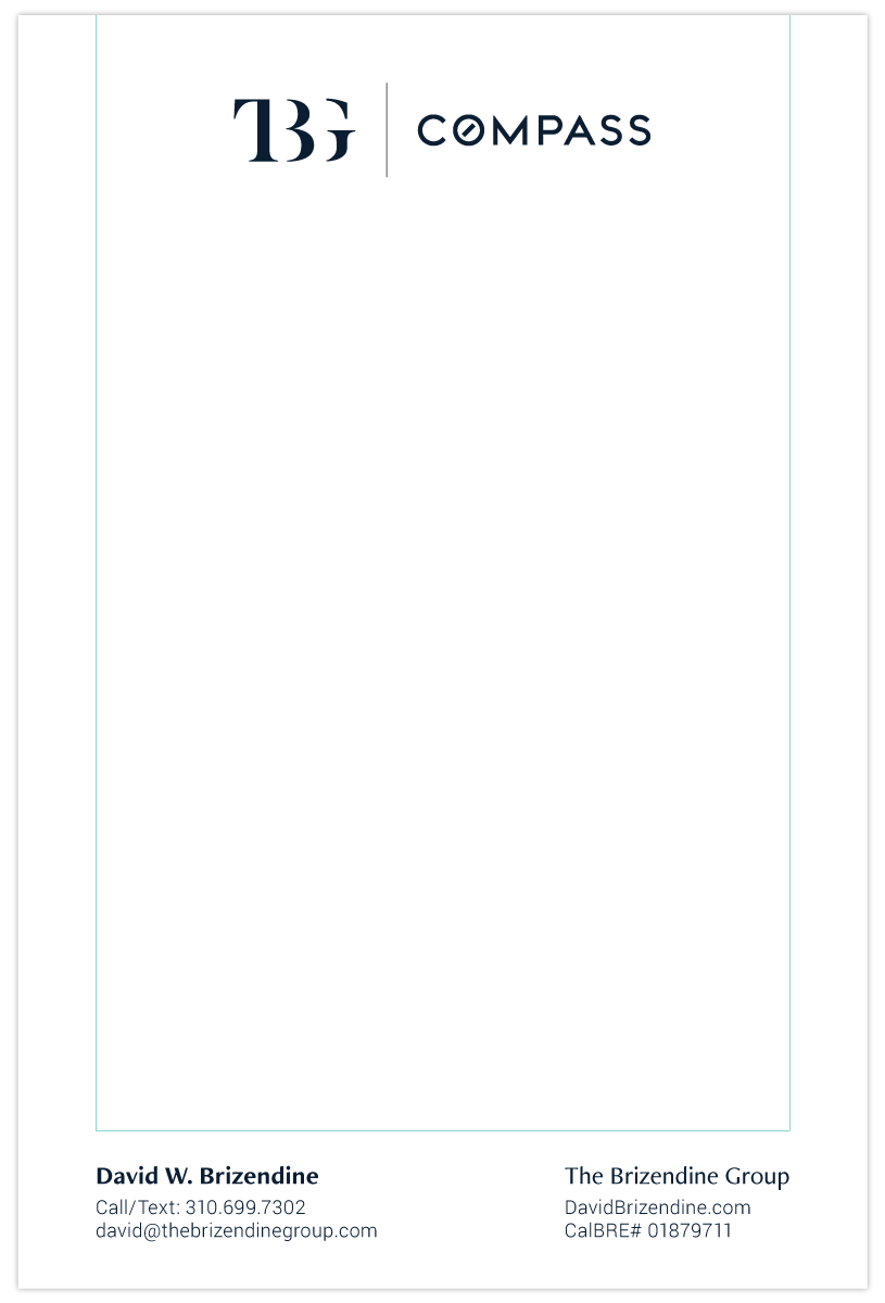
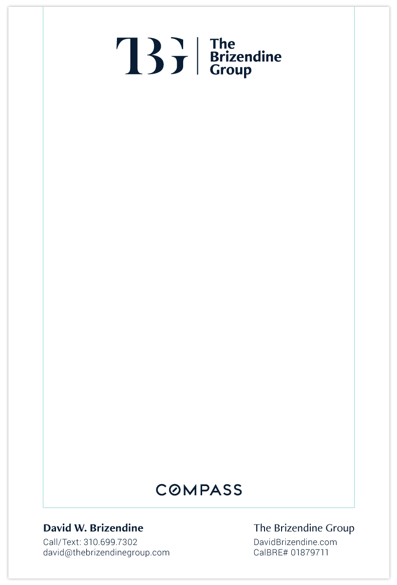
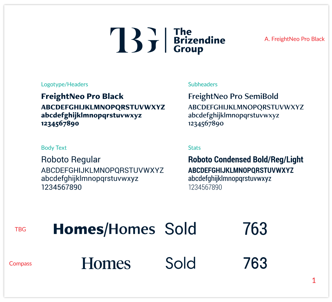
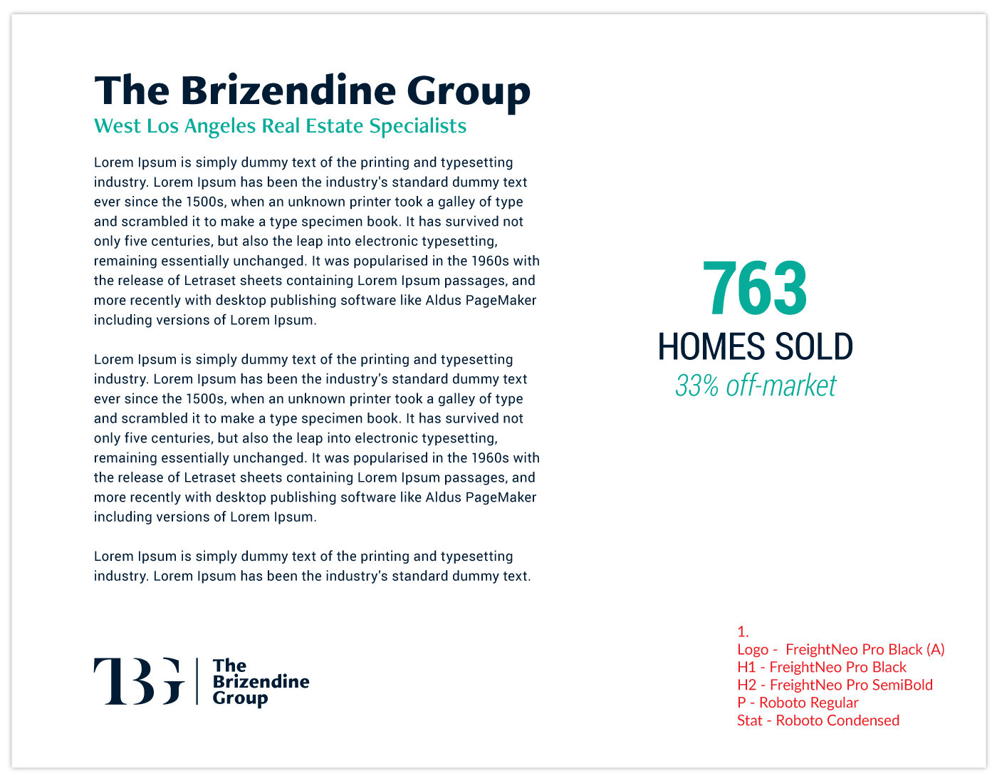
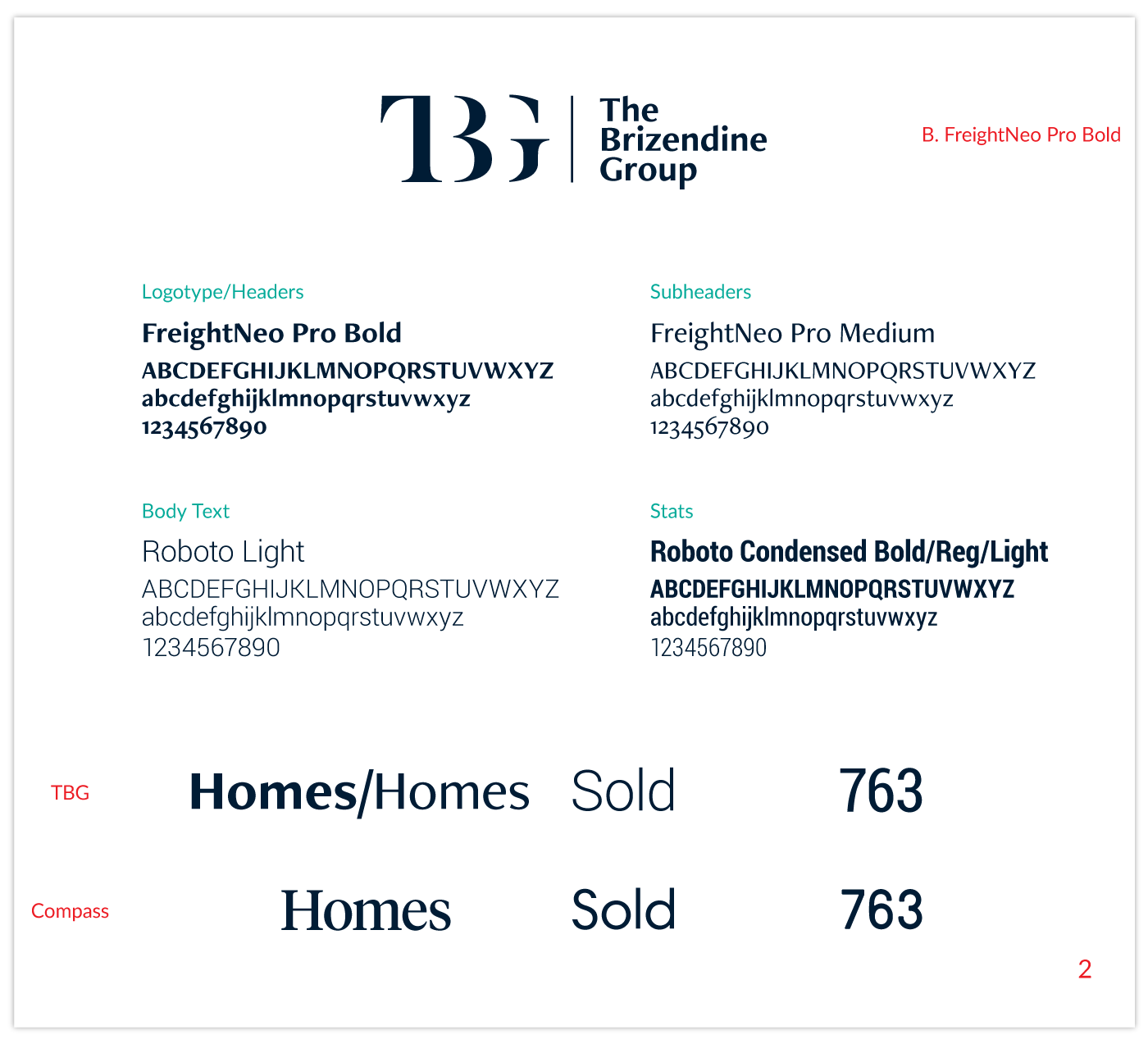
David wanted to make an update to his company's logotype and build on the brand identity created by Seth. He wanted to keep the current brand colors and explore the use of their turquoise accent color as well as explore new fonts. As a part of Compass, he wanted to develop some marketing content incorporating and that would go alongside the Compass branding. Below are the updates to his logotype, logo lockup, and Compass lockup, brand identity exploration and final brand guidelines, notepad options explored, and option for his monthly market update newsletter.
* Compass logo, dot/topographical patterns, icons are brand assets of Compass *
// Before and After – Logotype update and logo lockup //
// Logo – Color variations //
// Compass Lockup – Color variations //
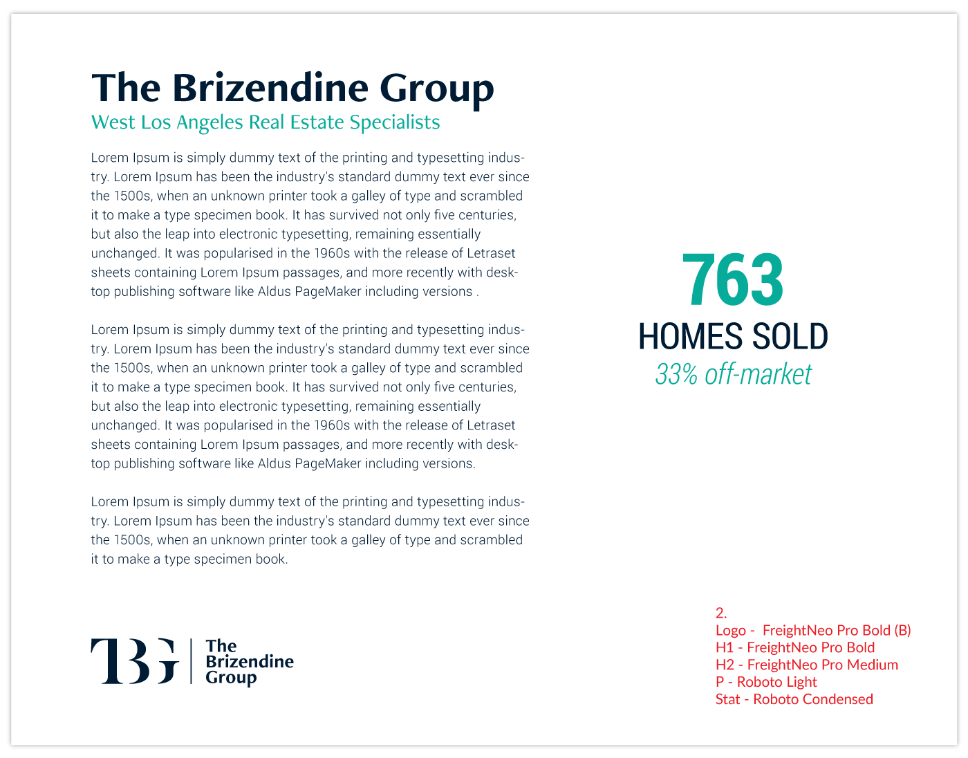
// Style Guide – One sheet and Type example //

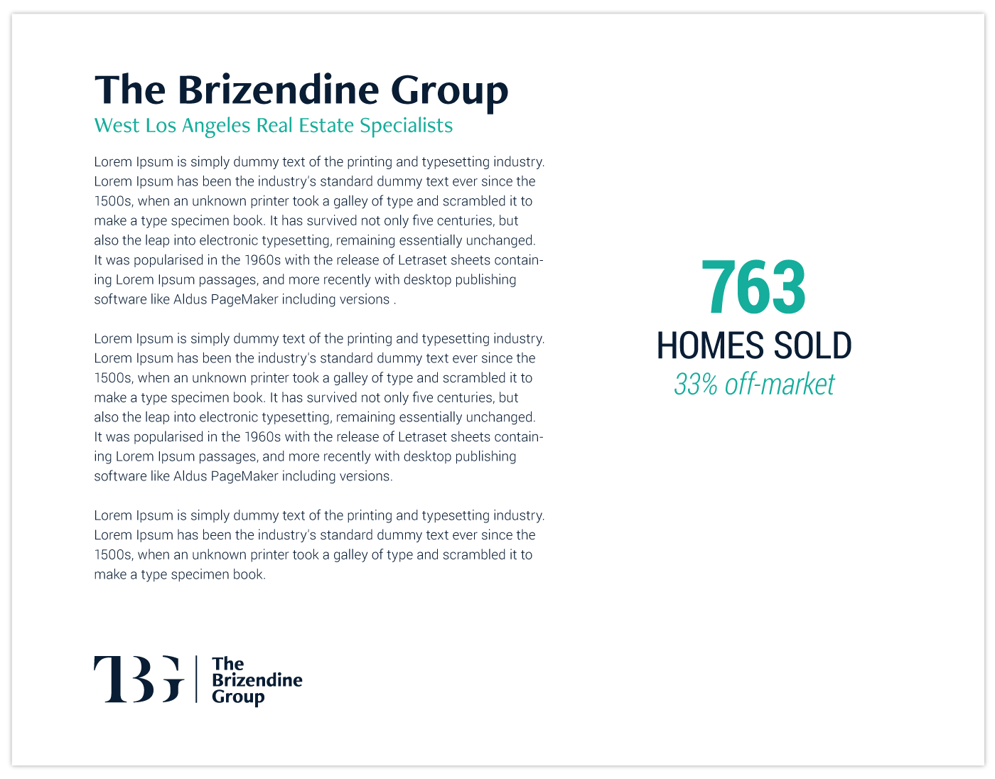
// Notepad and Market Update newsletter //

// Notepad exploration //



// Logotype and Typography exploration //
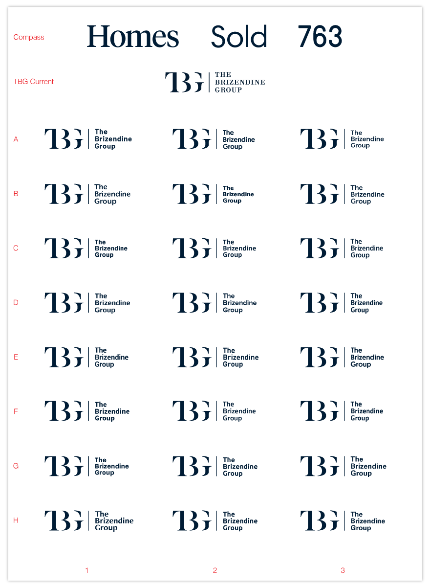
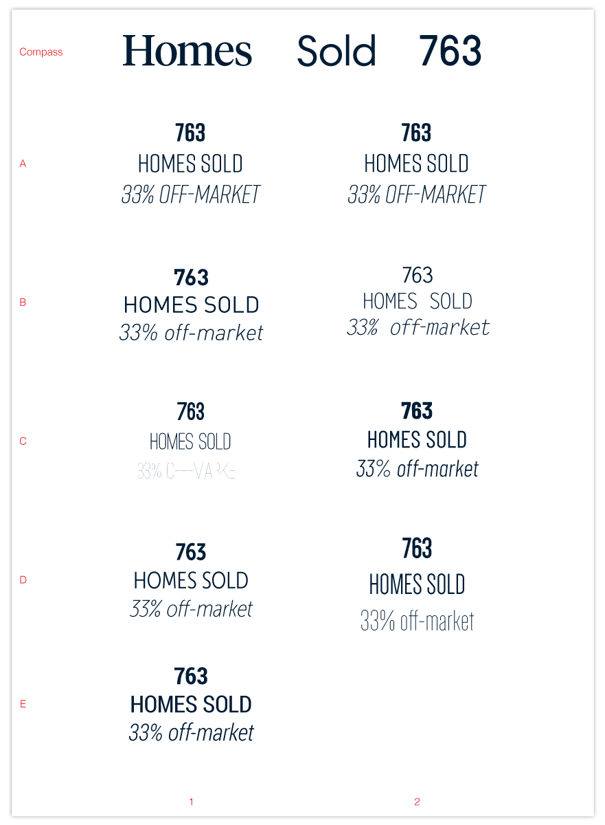
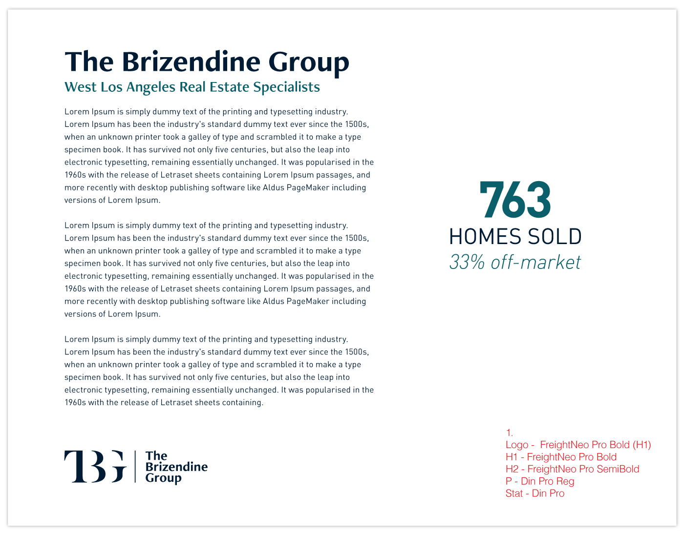
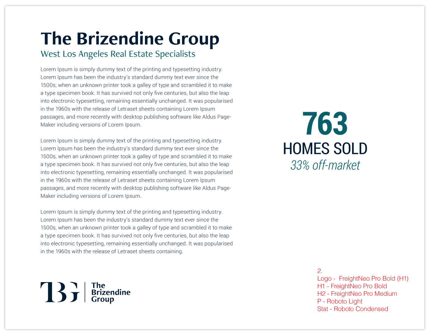
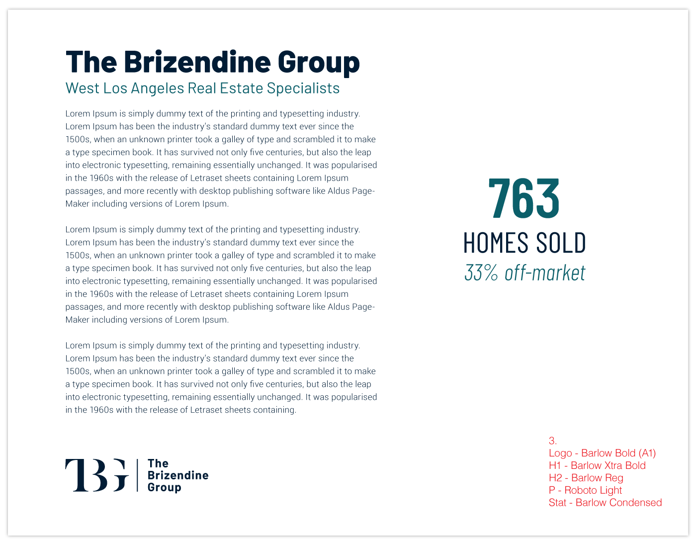
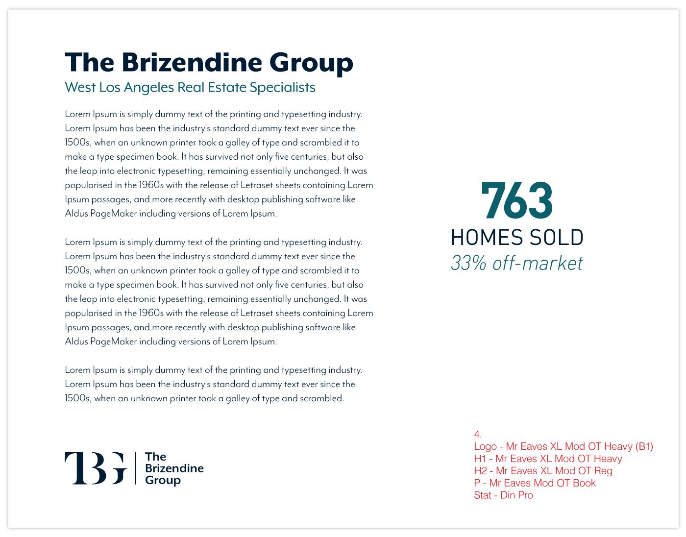
// Final Options – Logotype, type/color usage, turquoise color update //


// Thanks for viewing //

